
Branding, website, custom web application and User Experience campaign for a charity based in the UK.
In 2019 we followed up the below project with a user experience campaign.
You can skip to this section here.
The Catenian Bursary Fund are a registered charity in the UK offering financial assistance to young catholic people who wish to volunteer abroad in developing countries - predominantly in Asia, Africa and South America, and 'make a difference' to those who are less unfortunate. They also assist those wishing to go Lourdes (a small but significant town in France) to help the physically impaired who make the pilgrimage every year
Since 1981, young catholics were required to request an application form by email or letter, and submit a hard copy for evaluation by Trustees. The amount of grant or 'bursary' that the volunteer receives is based on criteria set out by the fund, such as length of project, or location.
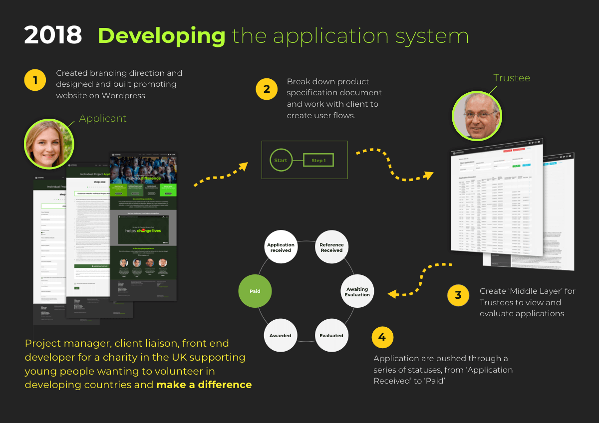
In 2018 the client wished to build website and web based app that would not only facilitate the submission of applications via the website, but also the management and evaluation of those applications, with statuses from received through to paid.
We started by working with the client to create a branding direction that would target young generation and establish an online presence in the form of a website. We knew that the users would likely lean towards mobile use, so the website needed to be eye-catching and inspiring to a younger demographic, and be mobile friendly across a wide range of devices.
The client had already prepared a detailed set of requirements in the form of a written document. This needed to be reviewed with the client to produce a realistic plan and specification document to fit the budget and technological contraints.
We decided to build the application system on Wordpress and use the CMS to facilitate the management of applications with a custom built PHP plugin. Once a realistic product outline had been agreed upon, we set about producing some wireframes that would illustrate both the front and back end of the system. Things were complicated by the requirement of several user roles with differing privileges, and a voting system where Trustees could anonymously vote and suggest awards.
We have been providing branding and print work for the client since 2018, and we produced a video and direction for them to use at a presentation in March 2019 at Wembley Stadium, London to an audience of just over 10,000 people.
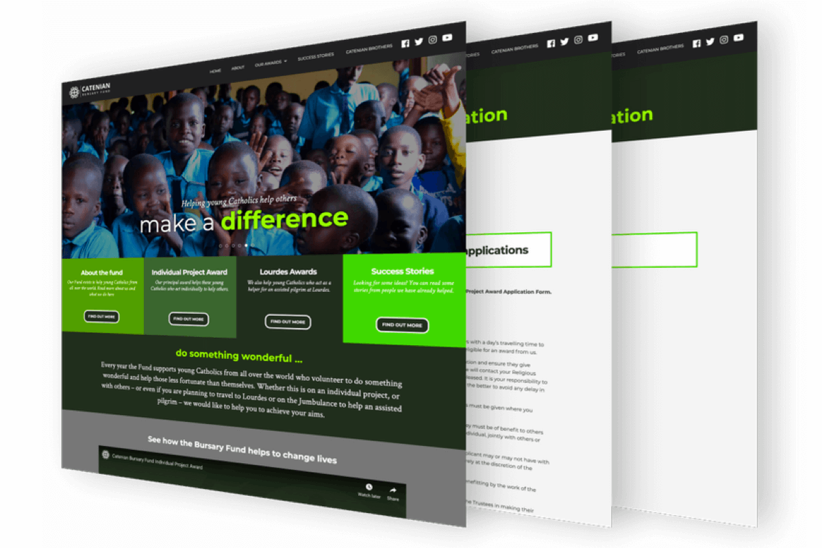 Custom website
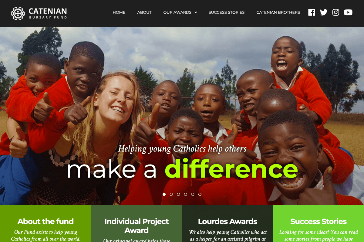 Front page
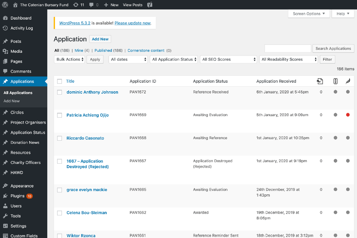 Admin Dashboard (Wordpress)
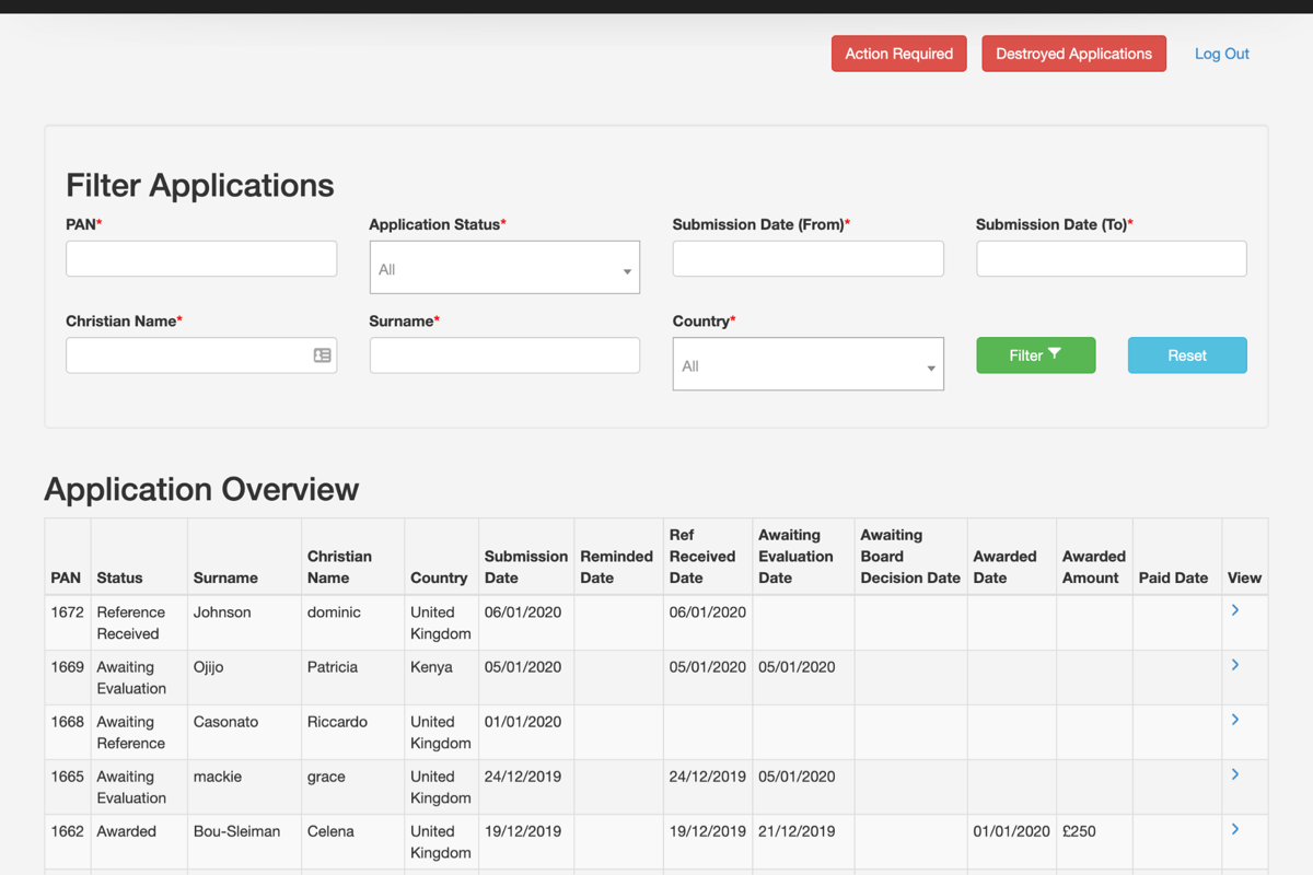 Admin Dashboard
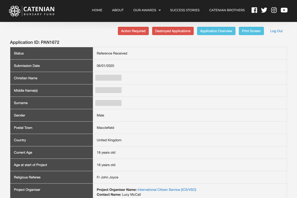 Single application view
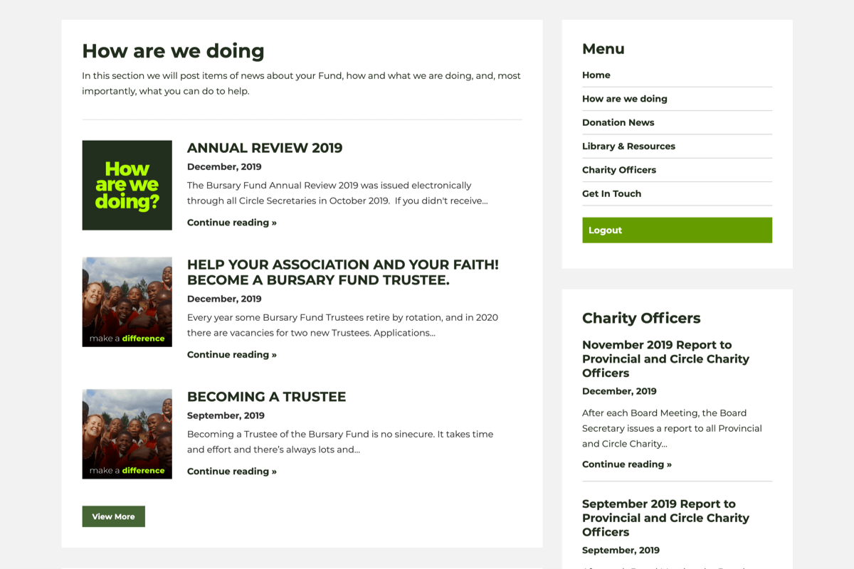 News section (Restricted content)
The website has been a success and has been in service now for almost two years with a steady increase in member applications. The member area has since expanded to include galleries and member related news.
We built the website and integrated into Wordpress so the client would be able to add, edit and remove content.
Wordpress made the website future-proof as the client may wish to expand the features of the site.
Secure area of the site for the client to be able to make announcements to its members.
Custom built plugin that enables users to apply for an "award" and for admin to be able to manage and assign values to applications.
We built the website and integrated into Wordpress so the client would be able to add, edit and remove content.
Wordpress made the website future-proof as the client may wish to expand the features of the site.
We used the popular Bootstrap CSS framework to speed up the building process and make sure the website is responsive for the latest devices.
Eye catching, custom design to engage potential applicants and encourage them to apply for financial support.
In 2019 we carried out a one-month user experience campaign to iterate on the custom web application we built in 2018, to discover what pain points both the applicants and admin team were experiencing and to see what adjustments could be made based on user insights.
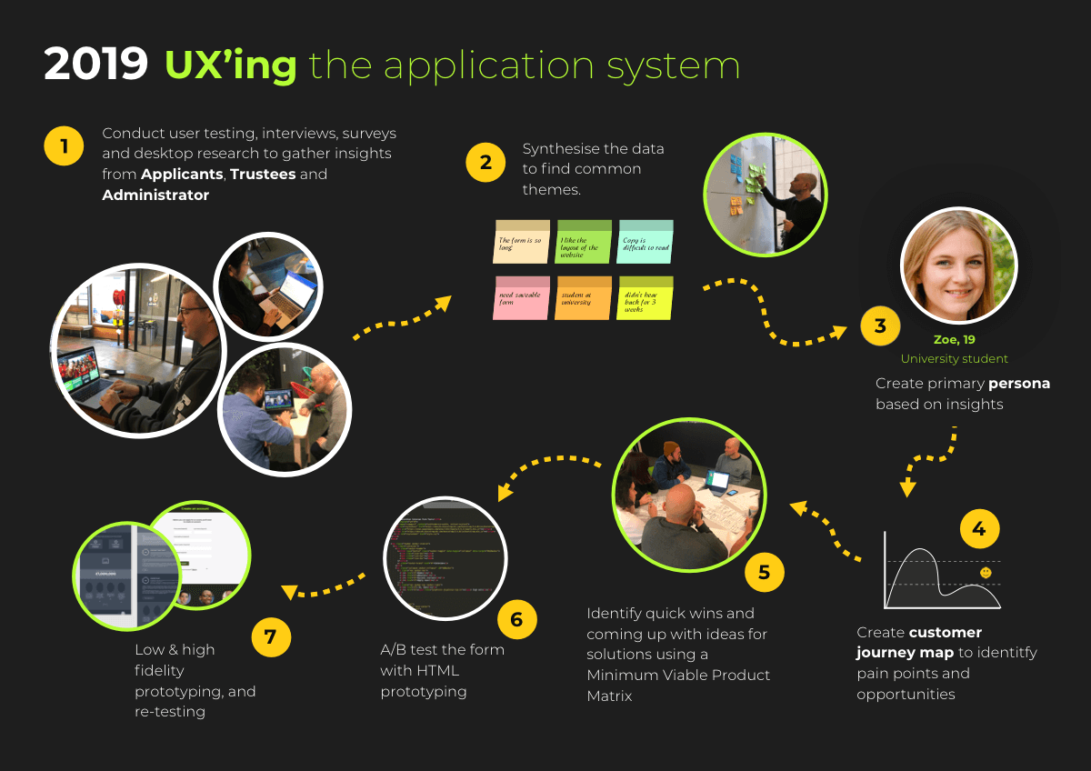
We used two methods for our research:
When we conducted one on one interviews with Admin and Trustees, it was clear that the key archetype was the applicant. After some lengthy international phone calls with real past applicants (and those still awaiting their awards), we were beginning to see the journeys that the typical applicant was making in applying for an award. We did some affinity mapping combining all the insights we had gathered to establish the key issues, and then start to flesh out a Persona.
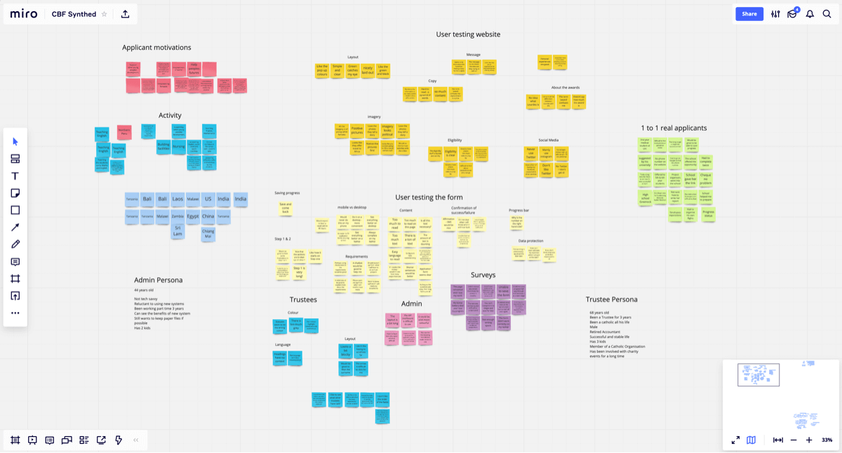
Many of the actual applicants were positive about the look and feel of the existing website. However, after user testing with Academy Xi students, it was clear that there were pain points, particularly around the organisation of information on the site, and confusing terminology.
A distinct persona emerged from our research:
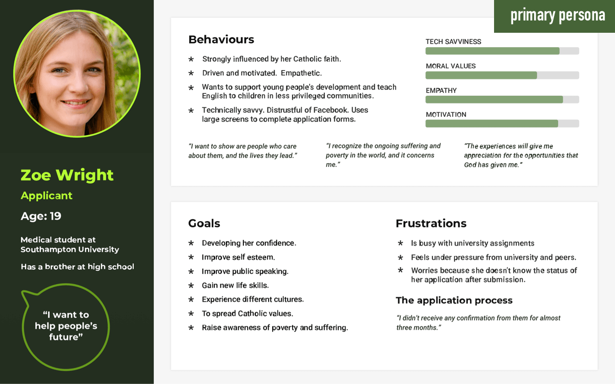
Zoe is a nineteen year old university student in the UK in her second year. She really wants to help others while seeing a Project as a way of developing her own life skills. She is motivated and heavily influenced by her Catholic faith.
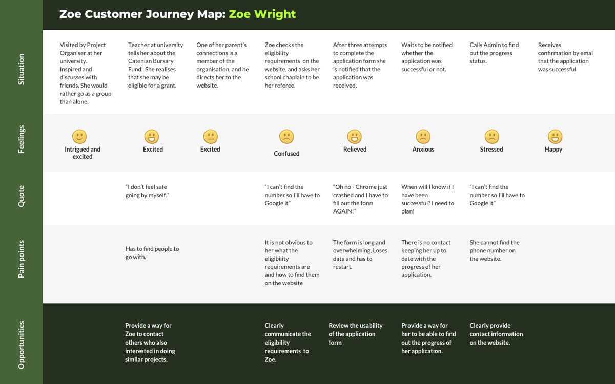
It was clear from mapping out Zoe's journey that the pain points were centred mainly around the following issues:
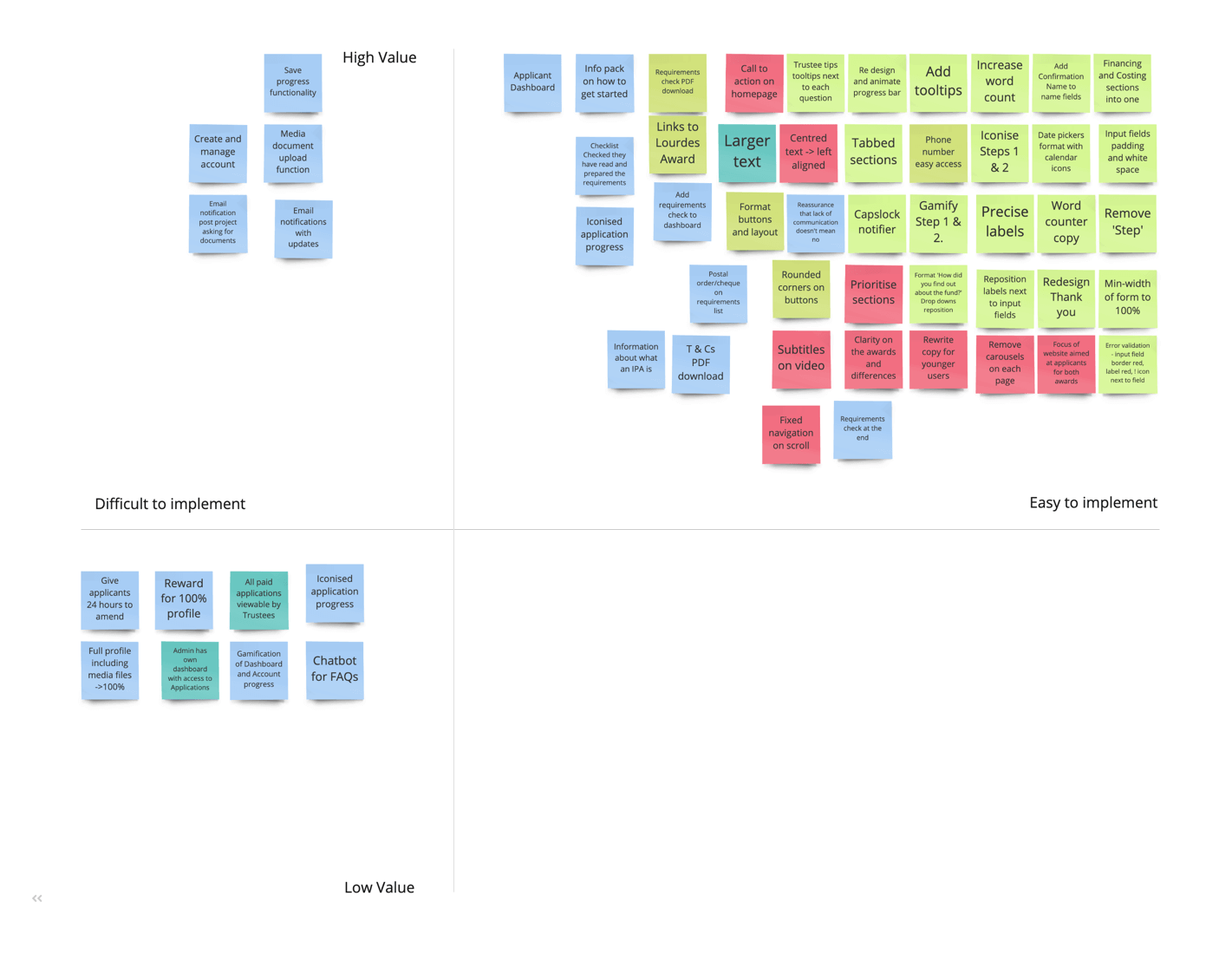
As we started to build the matrix, we relied on development experience to identify a significant number of quick wins that could be quickly implemented to make the user experience so much better with little cost and development time.
Form development and account management, while more difficult to build was high value, and would be key to successful redevelopment and happy users.
We facilitated a "Crazy Eights" session with some students at Academy Xi as a way of ideating on how applicant might be able to save their applications and how they might apply for an award.
Based on this research we quickly coded two form types (accordion and tabbed) in HTML and the Bootstrap CSS framework, with the intention of doing some A/B testing to see the preferred format. Both received positive responses, however we found that the accordion form type was not really useable with large amounts of content, which made the tabbed format a clear winner.
We then carried out some further desktop research to find out how other organisations and websites handle lengthy forms.
How might we make the application and progress monitoring process easier for Zoe?
Starting with the app download screen, the user needs to decide if they are a multi-store or a store-front. We removed jargon and added progress bars to give the user visual assistance. We also removed the PDF and replaced with video content.
After going out and user testing the low fidelity prototypes we fleshed out some more defined prototype using a style guide and branding to present to the client.
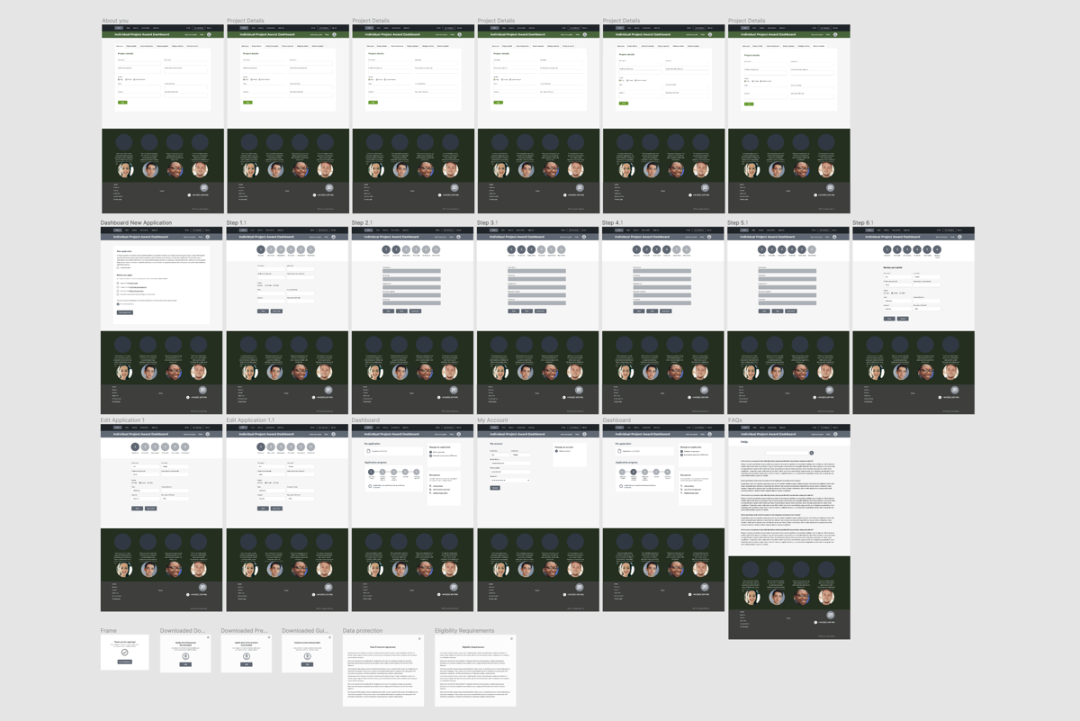
Using Figma, I created a low fidelity prototype that demonstrated the most valuable product - the form saving functionality and the application form itself. We went out and tested this on applicants to get some feedback and see what was working and what wasn't.
After some testing on high fidelity prototypes we found that users weren't able to see clearly how to submit the application, so we iterated on the design and re-tested on students at the Australian Catholic University.
The UX campaign highlighted some valuable insights and solutions to improve the website and application system for the user. In 2020 the client is hoping to implement some of these suggestions so that more users can successfully apply for financial support and make a difference in peoples' lives.
Time differences made research challenging as over 75% of award applicants were based in the UK. This meant making phone calls between 12am and 5am to fit into times suitable for university students. Another problem was the apparent reluctance of applicants to criticise the process. The main reason for this was their age and difficulty to read true feelings over the phone, rather than face to face.
Looking for some help to kickstart your next project?
Chat with us or send a quick message via our contact form and we'll get right back to you.