
A two week Agile sprint with the aim of reducing friction and churning during the onboarding process.
Syncio is a start up in Melbourne that launched in 2017.
They developed a Shopify app that allows online stores to create networks with other online stores, and sync inventories in real time. There are currently over 1700 merchants using Syncio, and collectively approximately $25m of gross merchandise value is synced per month.
A two-week Agile sprint.
After an initial meeting with the client, it was evident that they believed that some users were having difficulty during onboarding.
In collaboration with students at Academy Xi in Melbourne, we decided that our initial step would be to do some research - asking actual users what they thought of the onboarding process and fiding out whether they had any specific frustrations when setting up the app on their store.
How might we reduce friction during the onboarding process?
We used two methods for our research:
Cold calling was hit and miss. We found that of those stores willing to talk to us, only a few actually set the application up themselves. Many outsourced this task to developers who had experience with the Syncio app or similar software.
We found that while the owners of the stores had more patience with the onboarding process and persisting with the application, most storefront staff are not as tech-savvy and don't have the patience or experience to work out problems. This reflected in the large number of 'simple' support tickets that Syncio typically have to respond to.
No one was reading the user guide (PDF) and the general opinion was that it is far to long and difficult to read.
Breaking down the research data.
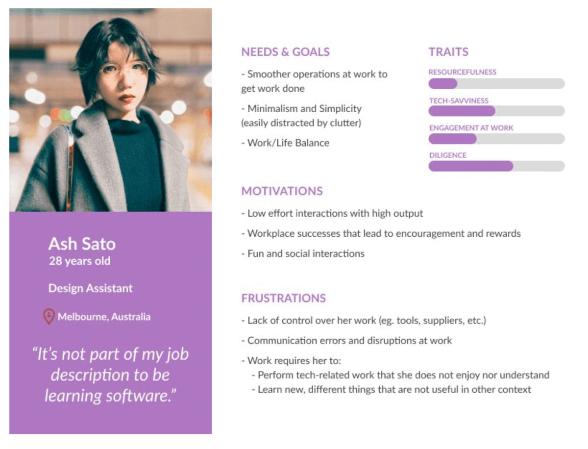
Two different personas emerged from our research:

Ash is a design assistant working at a storefront. She isn't particularly diligent and becomes quickly frustrated by apps that have a moderate to steep learning curve. She wouldn't read through the PDF manual that is central to the current on-boarding process.
She needs visual aids to help her, as she has low patience with desktop research when she doesn't know how to do something or an app doesn't appear to be working.
Starting with the app download screen, the user needs to decide if they are a multi-store or a store-front. We removed jargon and added progress bars to give the user visual assistance. We also removed the PDF and replaced with video content.
After going out and user testing the low fidelity prototypes we fleshed out some more defined prototype using a style guide and branding to present to the client.
Since implementing our recommendations the client has seen a significant reduction in support requests and churn, an increase in users!
Looking for some help to kickstart your next project?
Chat with us or send a quick message via our contact form and we'll get right back to you.